To create modular UI components capable of serving multiple brands within a shared design system. The goal was to maintain consistent functionality and accessibility while allowing each brand to express its unique identity through visual customization. This initiative aimed to reduce design and development overhead, improve scalability, and promote a product-oriented approach to component design.
The modular Card component was successfully adopted across seven distinct brands within the first quarter of its release, demonstrating its versatility and scalability. By leveraging a token-based theming system and a slot-based architecture, the component significantly reduced design and development time—cutting effort by approximately 40% for new brand rollouts. This not only improved operational efficiency but also ensured a consistent user experience across platforms while preserving each brand’s unique visual identity. The initiative elevated the design system’s maturity, shifting its role from a static toolkit to a dynamic, product-oriented platform. Additionally, it empowered teams to focus on higher-value work by minimizing redundant component creation and maintenance, ultimately fostering a more sustainable and scalable design ecosystem.
VF Emerging Brands
Figma, Jira, Baymard, Microsoft Copilot, YouTube
Myself, Lead UX Designer
Martina Sivieri, Senior UX Designer
Melissa Kerr, UX Manager & Overseer
Throughout the process of adding brands we have had several UI designers from an agency working within the system framework included in the growth of the project.
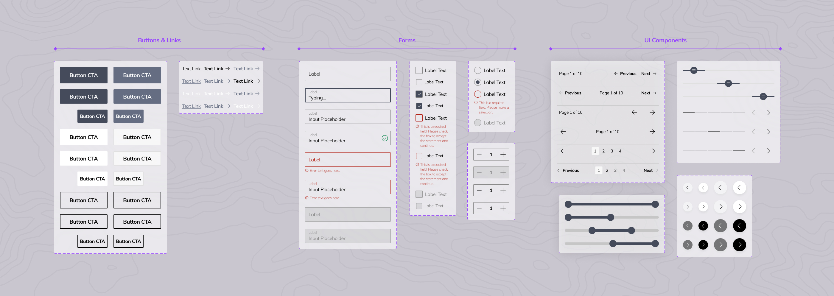
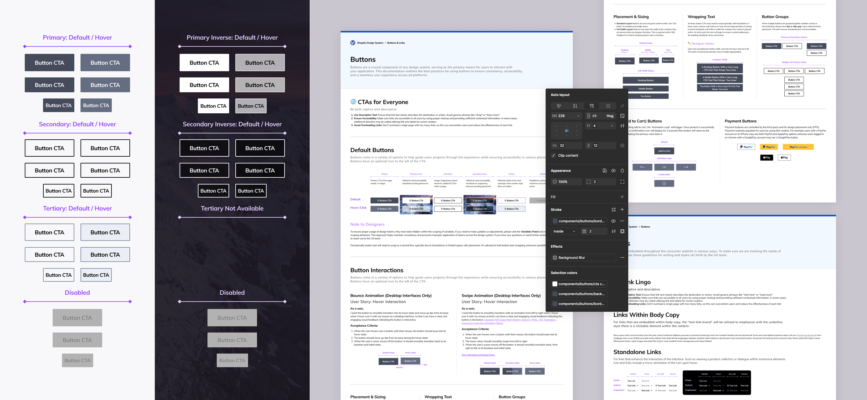
Buttons & Links
Buttons and links are among the most frequently used UI elements, and also the most visible expressions of brand tone. In our system, I designed a core set of button and link components with interaction patterns, accessibility standards, and responsive behavior. Through tokenized theming, each brand can apply its own typography, color palette, border radius, and iconography, resulting in buttons that feel native to the brand while maintaining a shared foundation. This component now supports five brands and counting, each with its own visual identity layered on top of a single, scalable codebase. Additionally as brands have come to the system we have been able to add now three interaction styles in which the brand may choose a single animation to use globally across their buttons site-wide for desktop interface users.
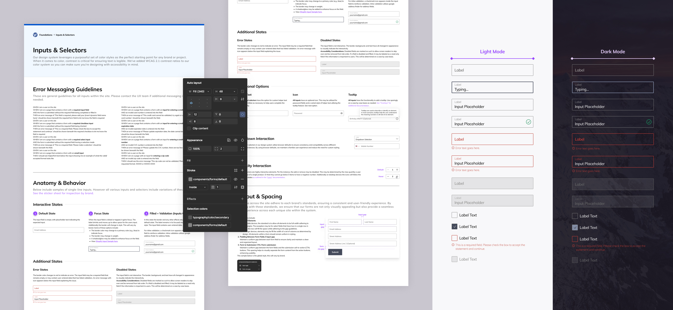
Forms
Forms are critical for user interaction and data collection, and they often reflect a brand’s personality through color tones, border radius, and micro-interactions. We developed a modular form system that includes inputs, selects, toggles, and validation messaging all built on a shared accessibility-first foundation. Each brand customizes the experience through token-driven styling and content guidelines, allowing for variations in field spacing, label styling, helper text tone, and error state visuals. Whether it’s a minimalist tech brand or a vibrant lifestyle brand, the form components adapt seamlessly ensuring usability and brand alignment across all implementations.
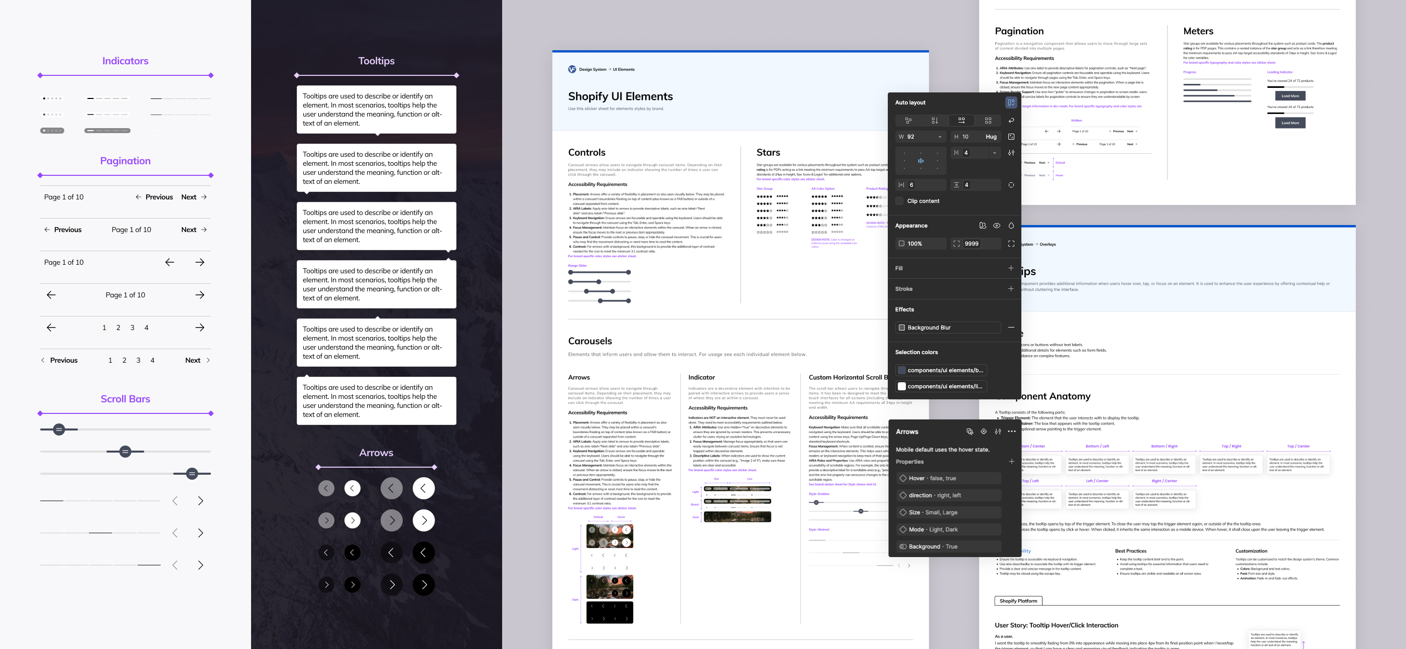
Overlays & UI Elements
This category includes foundational UI elements like arrows, custom scroll bars, tooltips, pagination, and meters. Small but essential pieces that contribute to the overall polish and personality of a product. I approached these elements as micro-products, each designed to be brand-agnostic at the core but highly expressive through theming. For example, a badge might appear as a sleek pill in one brand and a playful bubble in another, all while using the same underlying component. These elements are now themed for five brands, with new variations being added as the system expands—demonstrating how even the smallest components can scale with elegance and consistency.
By establishing brand-agnostic base components with a minimal setup and layering in brand-specific variables only as needed, the system was designed to scale for multi-brand use and scale quickly. This modular approach continues to enable the team to launch new brand UIs and product experiences within just five weeks of each brand kickoff, a pace that would have been impossible with traditional, one-off builds.
UI Collective YouTube Tutorials:
Design Pilot YouTube: Variables for Typography in Figma - The Ultimate Guide
2025 Kaitlyn O’Malley


